
Mobile first: How to ensure the best user experience across all platforms
Writed by:


Digital transformation has drastically changed the way people interact with brands. The growing use of mobile devices is a critical part of this shift.
According to the International Telecommunication Union (ITU), by 2023, 78% of the world’s population aged 10 and over will own a mobile phone, 11% more than the percentage of people who use the internet. In today’s digital world, where the majority of Internet access is via mobile devices, adapting products and services to this reality is critical to success.
This is where the concept of Mobile First comes in, a development approach that prioritizes the creation of optimized interfaces for smartphones and tablets.
Most of your users are mobile
We recently analyzed the percentage of users using computers and mobile phones on 10 of our clients’ websites. The data showed that only three of these sites had more desktop users than mobile users. See below.
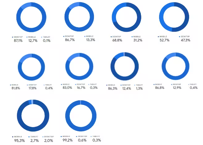
These sites, from companies in a variety of industries including healthcare, consumer products, telecommunications, public services, and technology, receive thousands to millions of monthly visitors. Taking a weighted average of traffic, we found that 74% of users access our sites from mobile devices.
Adapting to the new scenario
If most of your audience is browsing your website or using your software on their mobile phones, shouldn’t your development process reflect that?
We need to adapt our development processes. The environment around us has changed, and it makes no sense to continue using processes from the days when everyone used desktop computers all the time.
Ideally, your website or software should work perfectly on all devices. However, if you have to favor one platform, it should be the one that most of your users use.
Of course, the ideal is for your website or software to work perfectly on 100% of devices. But if you must choose a platform, which one should it be? Obviously, the one where most of your users are browsing.
Mobile First Development Strategies
Traditionally, development follows the order of creating computer screens first, which are presented, reviewed and approved, and then adapted for mobile.
In some cases, two completely independent versions are developed for each platform. However, we believe the best approach is to build the mobile version first and then adapt it for the desktop. This strategy is called Mobile First.
Benefits of Mobile First
There are several benefits to adopting mobile first:
Better experience for the majority: By designing for the smallest screen, you ensure a solid foundation for the user experience that can easily be improved for larger screens.
Ease of adaptation: Adapting desktop interfaces to mobile layouts is a tedious and error-prone process. Mobile First eliminates this step, optimizing time and resources.
Resource efficiency: Developing for mobile first ensures that the most effort is focused on the most important version, given cost and time constraints.
Overcoming barriers
One of the reasons many people still develop for the desktop first is because of the desktop-centric work environment. Presentation tools, videoconferencing, and usability testing are typically used on computers, which shapes development processes.
It is critical to make everyone aware of the importance of the mobile version. This includes developers, stakeholders, and the entire team. The presentation of layouts on mobile devices should be prioritized to ensure that the focus is on the actual user experience.
Adopting a mobile-first approach may seem challenging, but the benefits outweigh the difficulties. Ensuring that the mobile version is the most thorough and detailed will result in a more satisfying and consistent user experience.